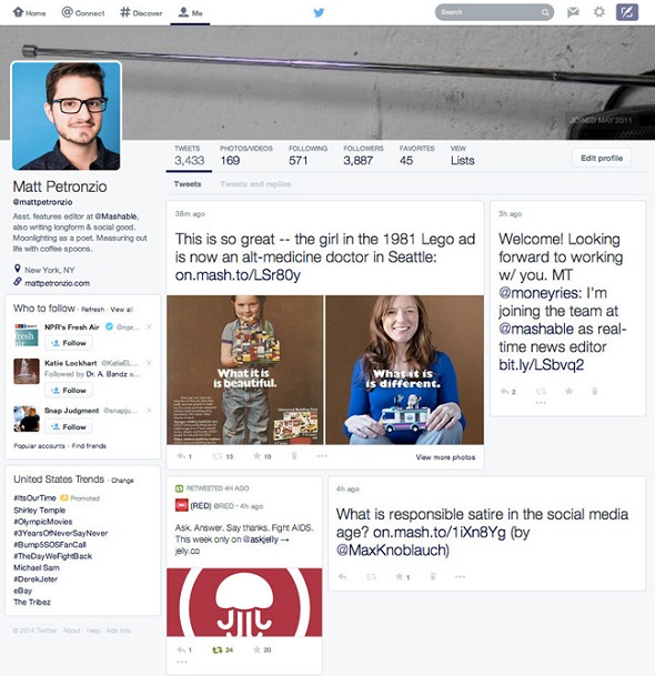
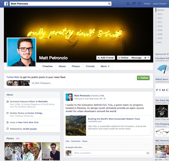
First came the white redesign, now get ready for the Facebook redesign of our favorite social network. The news in the field of social networking is therefore more than shocking. The author Matt Petronzio of Mashable was chosen as a member of a small reservoir users who confided the Twitter test of the redesigned platform. And of course the guy pulled a screenshot of the profile to show us the drastic changes in the user page.
The redesign thus includes features that are most pertinent to Facebook: the user picture placed elegantly in the upper left corner of the top of the profile, are the biographical data and the collection of tabs, tweets, following, followers, favorites, lists, and the new category Photo/Video, which make us forget the traditional profile of Twitter and open up a new future Facebook.


Even the most tweets illustrated in windows of different sizes, which is read from left to right, like a book. Picking up all of this together, what do we have? But the new Twitter twin of Facebook and the Google+ of course, what else? Obviously, the changes now give the floor to the first media of Twitter rather than on peeps. The pilot course redesign is still in the experimental stage and is not sure that will be released in the form we see, might nevertheless have been just witnessed the future of the popular social media.
If, however, prevail this version of Twitter, you are indeed a pity, as it will lose its special characteristics that have established in our hearts. And after all, if it is to be a clone of Facebook, then what do we need? The Twitter has not yet made any comments, although it wont be trialled its new versions before the drop in the market.
By Nicole P.


